Getting Started With Histlite
In this brief tutorial, we introduce the basics of creating, manipulating, and plotting histograms using histlite.
[1]:
import numpy as np
import matplotlib.pyplot as plt
from scipy import stats
import histlite as hl

%matplotlib inline
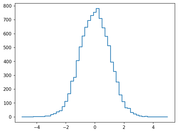
First histogram
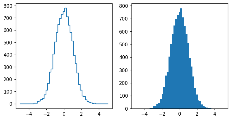
For our first histogram, let’s use some normally-distributed random data and default binning in one dimension:
[2]:
x = np.random.normal(size=10**4)
[3]:
h = hl.hist(x)
[4]:
fig, ax = plt.subplots()
hl.plot1d(ax, h)
We immediately notice that for this type of data, it may be useful to select symmetric binning including a central bin at 0:
[5]:
h = hl.hist(x, bins=51, range=(-5, 5))
[6]:
fig, ax = plt.subplots()
hl.plot1d(ax, h)
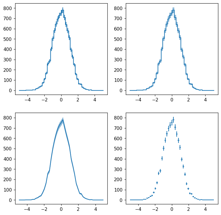
Histlite keeps track of per-bin error estimates, and we can display them with many different styles. Let’s try plotting with errorbars, errorbands, errorbands with smooth lines rather than steps, and crosses:
[7]:
fig, ax = plt.subplots(2, 2, figsize=(8, 8))
hl.plot1d(ax[0][0], h, errorbars=True)
hl.plot1d(ax[0][1], h, errorbands=True)
hl.plot1d(ax[1][0], h, errorbands=True, drawstyle='default')
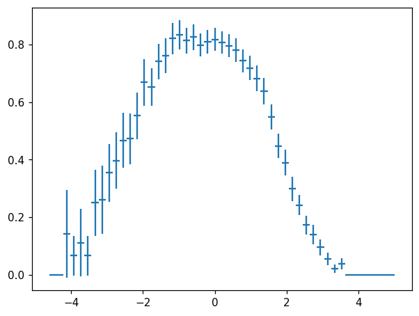
hl.plot1d(ax[1][1], h, crosses=True)
/home/mike/.local/lib/python3.8/site-packages/matplotlib/axes/_base.py:2283: UserWarning: Warning: converting a masked element to nan.
  xys = np.asarray(xys)
/home/mike/.local/lib/python3.8/site-packages/matplotlib/axes/_base.py:2283: UserWarning: Warning: converting a masked element to nan.
  xys = np.asarray(xys)
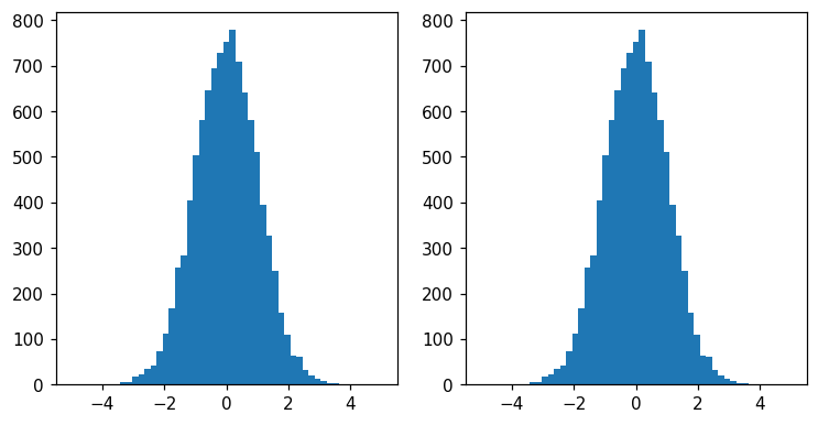
You have probably noticed that the plotting style differs from matplotlib’s standard:
[8]:
fig, ax = plt.subplots(1, 2, figsize=(8, 4))
hl.plot1d(ax[0], h)
ax[1].hist(x, bins=h.bins[0]);
As we will see, much of the design of histlite is centered on simply dealing with binned rather than smooth curves. However, the classic matplotlib style(and more) can still be obtained:
[9]:
fig, ax = plt.subplots(1, 2, figsize=(8, 4))
hl.fill_between(ax[0], 0, h)
ax[0].set_ylim(0)
ax[1].hist(x, bins=h.bins[0]);
Data model
The “light” in histlite refers to the deliberately simple data structure. A histlite histogram is essentially just a bundle of bins, values, and error estimates. These are the required initialization arguments which are determined from data and arguments to factory functions such as histlite.hist(). They are also read-only properties of each Hist:
[10]:
print(h.bins)
print(h.values)
print(h.errors)
[array([-5.        , -4.80392157, -4.60784314, -4.41176471, -4.21568627,
       -4.01960784, -3.82352941, -3.62745098, -3.43137255, -3.23529412,
       -3.03921569, -2.84313725, -2.64705882, -2.45098039, -2.25490196,
       -2.05882353, -1.8627451 , -1.66666667, -1.47058824, -1.2745098 ,
       -1.07843137, -0.88235294, -0.68627451, -0.49019608, -0.29411765,
       -0.09803922,  0.09803922,  0.29411765,  0.49019608,  0.68627451,
        0.88235294,  1.07843137,  1.2745098 ,  1.47058824,  1.66666667,
        1.8627451 ,  2.05882353,  2.25490196,  2.45098039,  2.64705882,
        2.84313725,  3.03921569,  3.23529412,  3.43137255,  3.62745098,
        3.82352941,  4.01960784,  4.21568627,  4.41176471,  4.60784314,
        4.80392157,  5.        ])]
[  0.   0.   0.   0.   1.   1.   1.   1.   6.   6.  17.  23.  35.  43.
  73. 111. 167. 258. 284. 404. 503. 582. 645. 695. 729. 753. 780. 709.
 641. 580. 512. 395. 326. 250. 158. 110.  64.  60.  32.  20.  12.   7.
   2.   4.   0.   0.   0.   0.   0.   0.   0.]
[ 0.          0.          0.          0.          1.          1.
  1.          1.          2.44948974  2.44948974  4.12310563  4.79583152
  5.91607978  6.55743852  8.54400375 10.53565375 12.92284798 16.0623784
 16.85229955 20.09975124 22.42766149 24.12467616 25.3968502  26.36285265
 27.         27.44084547 27.92848009 26.62705391 25.3179778  24.08318916
 22.627417   19.87460691 18.05547009 15.8113883  12.56980509 10.48808848
  8.          7.74596669  5.65685425  4.47213595  3.46410162  2.64575131
  1.41421356  2.          0.          0.          0.          0.
  0.          0.          0.        ]
Note that bins is a list of per-axis ndarrays. Here we have a 1D histogram, and so a single axis, but in general histlite histograms are N-dimensional. Note also that the errors are \(\sqrt{N}\) per bin for unweighted histograms, which is a special case for a general implementation where the errors are \(\sqrt{\left(\sum_i w_i^2\right)}\) for events \(\{i\}\) per bin for weighted histograms.
On construction, it is determined whether bins are log-spaced(which can be conveniently requested of histlite.hist(), as we will see later). This information is exposed as an array of per-axis bools:
[11]:
print(h.log)
[False]
We also access to the per-axis number of bins, binning ranges, and bin centers:
[12]:
print(h.n_bins)
print(h.range)
print(h.centers)
[51]
[(-5.0, 5.0)]
[array([-4.90196078, -4.70588235, -4.50980392, -4.31372549, -4.11764706,
       -3.92156863, -3.7254902 , -3.52941176, -3.33333333, -3.1372549 ,
       -2.94117647, -2.74509804, -2.54901961, -2.35294118, -2.15686275,
       -1.96078431, -1.76470588, -1.56862745, -1.37254902, -1.17647059,
       -0.98039216, -0.78431373, -0.58823529, -0.39215686, -0.19607843,
        0.        ,  0.19607843,  0.39215686,  0.58823529,  0.78431373,
        0.98039216,  1.17647059,  1.37254902,  1.56862745,  1.76470588,
        1.96078431,  2.15686275,  2.35294118,  2.54901961,  2.74509804,
        2.94117647,  3.1372549 ,  3.33333333,  3.52941176,  3.7254902 ,
        3.92156863,  4.11764706,  4.31372549,  4.50980392,  4.70588235,
        4.90196078])]
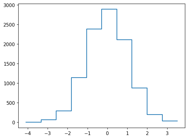
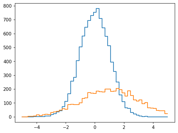
Working with multiple histograms
Let’s generate data for a second histogram:
[13]:
x2 = np.random.normal(loc=1, scale=2, size=int(x.size/2))
We would like a second histogram, h2, to be used with the original one, h. For this, we require the binning to match. One way this can be achieved is to bin x2 using h.bins:
[14]:
h2 = hl.hist(x2, bins=h.bins)
[15]:
fig, ax = plt.subplots()
hl.plot1d(ax, h)
hl.plot1d(ax, h2)

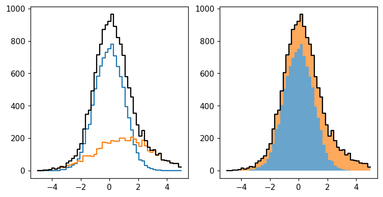
This can also be expressed as follows:
[16]:
h2 = hl.hist_like(h, x2)
[17]:
fig, ax = plt.subplots()
hl.plot1d(ax, h)
hl.plot1d(ax, h2)
We can perform a number of intuitive operations using these two histograms. The most obvious application is to sum them:
[18]:
fig, axs = plt.subplots(1, 2, figsize=(8, 4))

ax = axs[0]
hl.plot1d(ax, h)
hl.plot1d(ax, h2)
hl.plot1d(ax, h + h2, color='k')

ax = axs[1]
hl.stack1d(ax, [h, h2], colors='C0 C1'.split(), alpha=.67, lw=0)
hl.plot1d(ax, h + h2, color='k')
We can also create more elaborate constructs — and standard error propagation will be applied throughout:
[19]:
fig, ax = plt.subplots()
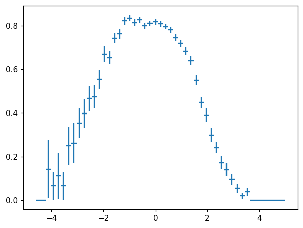
hl.plot1d(ax, h / (h + h2), crosses=True)
/home/mike/.local/lib/python3.8/site-packages/matplotlib/axes/_base.py:2283: UserWarning: Warning: converting a masked element to nan.
  xys = np.asarray(xys)
An observant reader may notice that in this particular case, the errors on h and h + h2 are correlated, and thus naive error propagation overestimates the errors. Histlite provides a convenient way to obtain error estimates with proper coverage for the special case of \(\text{denominator} = \text{numerator} + \text{something else}\):
[20]:
fig, ax = plt.subplots()
hl.plot1d(ax, h.efficiency(h + h2), crosses=True)
/home/mike/.local/lib/python3.8/site-packages/matplotlib/axes/_base.py:2283: UserWarning: Warning: converting a masked element to nan.
  xys = np.asarray(xys)
We also see from the above examples that histlite.Hist is not strictly required to be meaningfully interpretted as a “histogram” in the classic sense. For example, it is perfectly happy with negative values:
[21]:
fig, ax = plt.subplots()
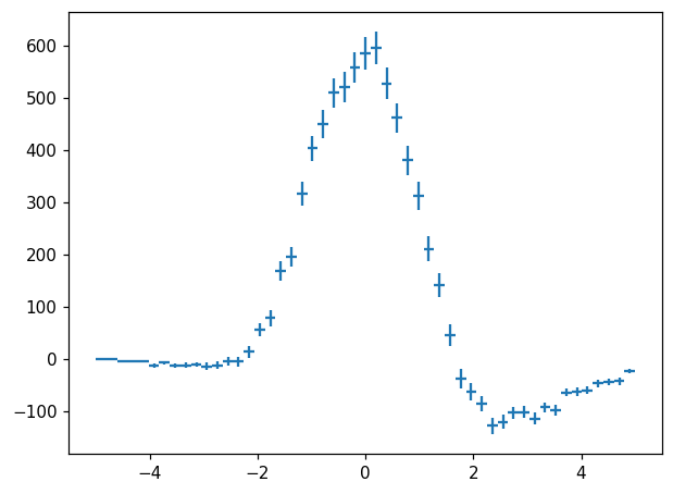
hl.plot1d(ax, h - h2, crosses=True)
/home/mike/.local/lib/python3.8/site-packages/matplotlib/axes/_base.py:2283: UserWarning: Warning: converting a masked element to nan.
  xys = np.asarray(xys)
One can imagine constructing a highly descriptive class hierarchy to represent all manner of data structures that boil down to “values and errors per bin”. For histlite, we made the design decision to represent all of these with histlite.Hist to avoid the sort of complexity we see in, for example, integer to float promotion under division.
First 2D histogram
As mentioned above, histlite is fully generalized to N-dimensions throughout, with no special-casing for specific numbers of dimensions. Let’s try constructing a 2D histogram:
[22]:
y = np.random.normal(loc=0, scale=2, size=x.size)
[23]:
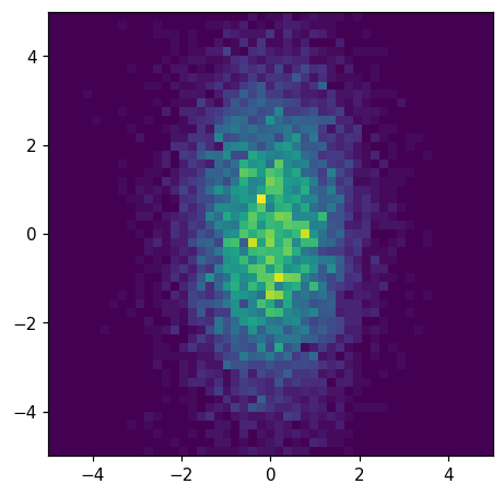
hh = hl.hist((x, y), bins=51, range=(-5, 5))
We can plot this histogram, hh, easily like so:
[24]:
fig, ax = plt.subplots()
ax.set_aspect('equal')
hl.plot2d(ax, hh)
[24]:
<matplotlib.collections.QuadMesh at 0x7f079ae42160>
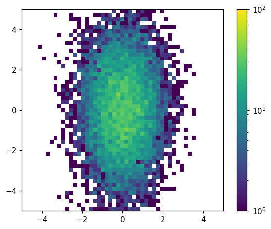
We have a number of options for customizing this plot. Let’s try adding a colorbar, log-scaling the colormap, and specifying the color limits:
[25]:
fig, ax = plt.subplots()
ax.set_aspect('equal')
hl.plot2d(ax, hh, cbar=True, log=True, vmin=1, vmax=1e2)
[25]:
{'colormesh': <matplotlib.collections.QuadMesh at 0x7f079b0e91c0>,
 'colorbar': <matplotlib.colorbar.Colorbar at 0x7f079abf0700>}
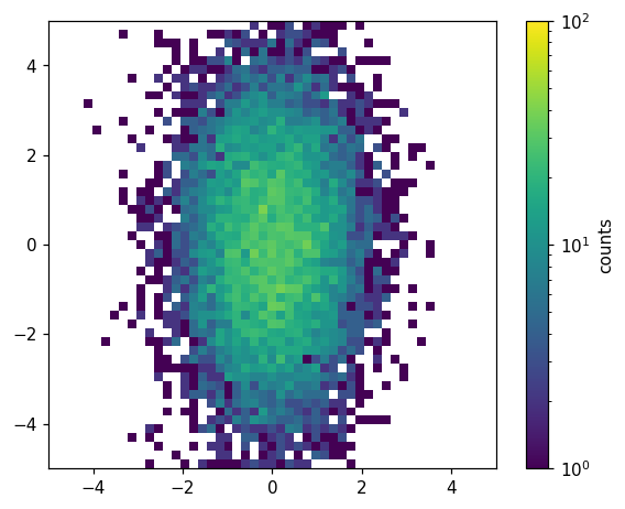
Unlike the histlite.plot1d() case, it is often convenient to customize the underlying matplotlib objects after histlite.plot2d() is finished. For example, we may want to label the colorbar. We can do this by digging into the dictionary returned by histlite.plot2d():
[26]:
fig, ax = plt.subplots()
ax.set_aspect('equal')
d = hl.plot2d(ax, hh, cbar=True, log=True, vmin=1, vmax=1e2)
d['colorbar'].set_label('counts')
Brief survey of additional features
In this tutorial, we try to cover the basics that will let you start making plots as quickly as possible. Histlite has much more to offer. We will cover the details in other notebooks, but here we offer a teaser with little to no explanation.
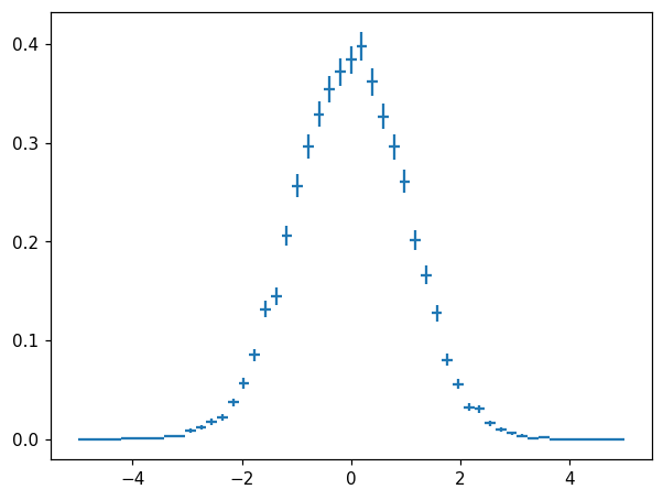
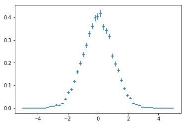
Normalization
[27]:
fig, ax = plt.subplots()
hn = h.normalize()
print(hn)
print('integral of hn is', hn.integrate().values)
hl.plot1d(ax, hn, crosses=True)
Hist(51 bins in [-5.0,5.0], with sum 5.1, 11 empty bins, and 0 non-finite values)
integral of hn is 1.0
/home/mike/.local/lib/python3.8/site-packages/matplotlib/axes/_base.py:2283: UserWarning: Warning: converting a masked element to nan.
  xys = np.asarray(xys)
[28]:
fig, ax = plt.subplots()
ax.set_aspect('equal')
hl.plot2d(ax, hh.normalize(), cbar=True)
[28]:
{'colormesh': <matplotlib.collections.QuadMesh at 0x7f079aca1fa0>,
 'colorbar': <matplotlib.colorbar.Colorbar at 0x7f079acd97f0>}
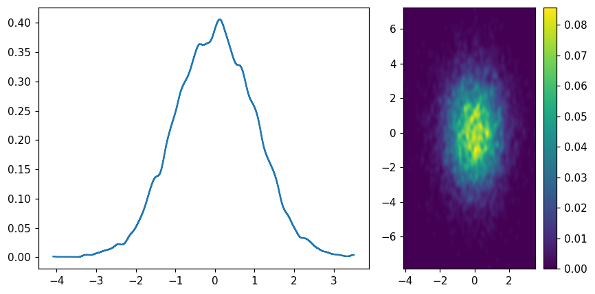
Pseudo-KDE(kernel density estimation)
[29]:
fig, (ax1, ax2) = plt.subplots(1, 2, figsize=(8, 4), gridspec_kw=dict(width_ratios=(2,1)))
hl.plot1d(ax1, hl.kde(x))
hl.plot2d(ax2, hl.kde((x, y)), cbar=True)
ax2.set_aspect('equal')
plt.tight_layout()
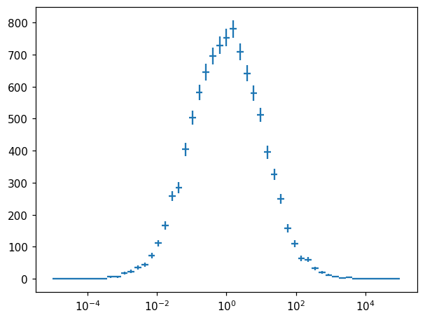
Axis transformation
[30]:
fig, ax = plt.subplots()
h_exp = h.transform_bins(lambda x: 10**x)
ax.semilogx()
hl.plot1d(ax, h_exp, crosses=True)
/home/mike/.local/lib/python3.8/site-packages/matplotlib/axes/_base.py:2283: UserWarning: Warning: converting a masked element to nan.
  xys = np.asarray(xys)
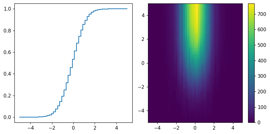
Cumulative sums
[31]:
fig, (ax1, ax2) = plt.subplots(1, 2, figsize=(8, 4))
hl.plot1d(ax1, h.cumsum() / h.sum())
hl.plot2d(ax2, hh.cumsum(), cbar=True)
plt.tight_layout()
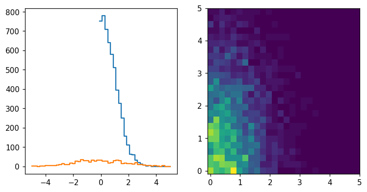
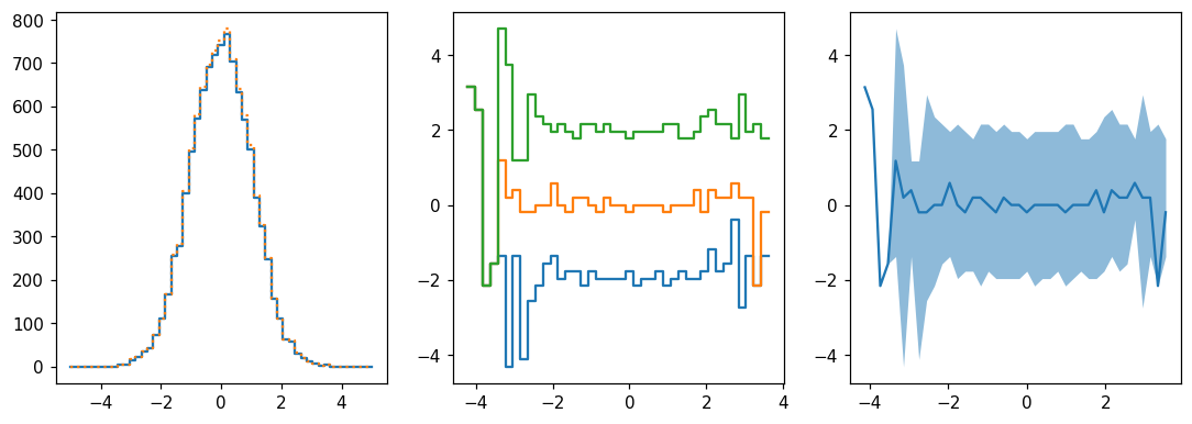
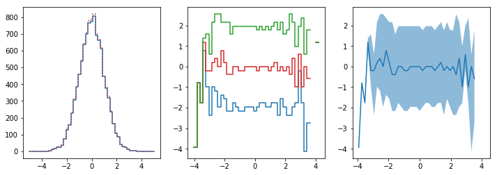
Projections
[32]:
fig, (ax1, ax2, ax3) = plt.subplots(1, 3, figsize=(12,4))
hl.plot1d(ax1, hh.project([0]))
hl.plot1d(ax1, h, ls=':') # slightly more elements since some y's were under/overflow

for frac in (.16, .5, .84):
    hl.plot1d(ax2, hh.contain(-1, frac))

hl.plot1d(ax3, hh.contain_project(-1),  # 1σ errors by default
           drawstyle='default', errorbands=True)
[33]:
fig, ax = plt.subplots()
x3 = np.random.uniform(-5, 5, size=10**4)
y3 = np.random.normal(loc=x3**2, scale=1 + np.abs(x3))
hl.plot1d(ax, hl.hist((x3, y3), bins=100).contain_project(-1),
           errorbands=True, drawstyle='default')
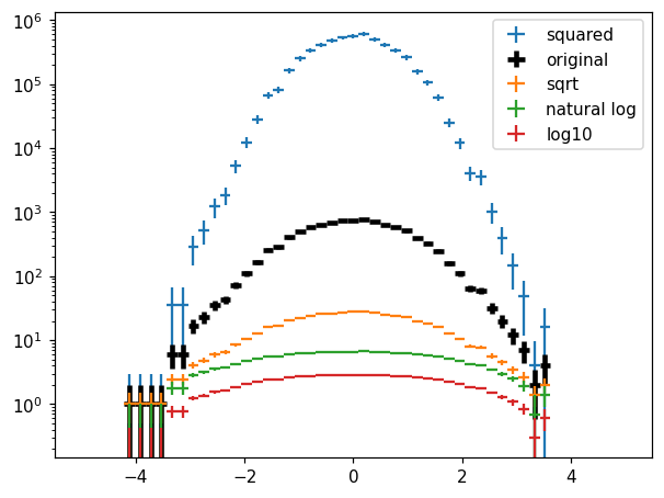
Values transformation
[34]:
fig, ax = plt.subplots()
kw = dict(crosses=True)
hl.plot1d(ax, h**2, label='squared', **kw)
hl.plot1d(ax, h, label='original', color='k', lw=3, **kw)
hl.plot1d(ax, h.sqrt(), label='sqrt', **kw)
hl.plot1d(ax, h.ln(), label='natural log', **kw)
hl.plot1d(ax, h.log10(), label='log10', **kw)
ax.semilogy(nonpositive='clip')
ax.legend();
/home/mike/.local/lib/python3.8/site-packages/matplotlib/axes/_base.py:2283: UserWarning: Warning: converting a masked element to nan.
  xys = np.asarray(xys)
/home/mike/.local/lib/python3.8/site-packages/matplotlib/axes/_base.py:2283: UserWarning: Warning: converting a masked element to nan.
  xys = np.asarray(xys)
/home/mike/.local/lib/python3.8/site-packages/matplotlib/axes/_base.py:2283: UserWarning: Warning: converting a masked element to nan.
  xys = np.asarray(xys)
/home/mike/.local/lib/python3.8/site-packages/matplotlib/axes/_base.py:2283: UserWarning: Warning: converting a masked element to nan.
  xys = np.asarray(xys)
/home/mike/.local/lib/python3.8/site-packages/matplotlib/axes/_base.py:2283: UserWarning: Warning: converting a masked element to nan.
  xys = np.asarray(xys)
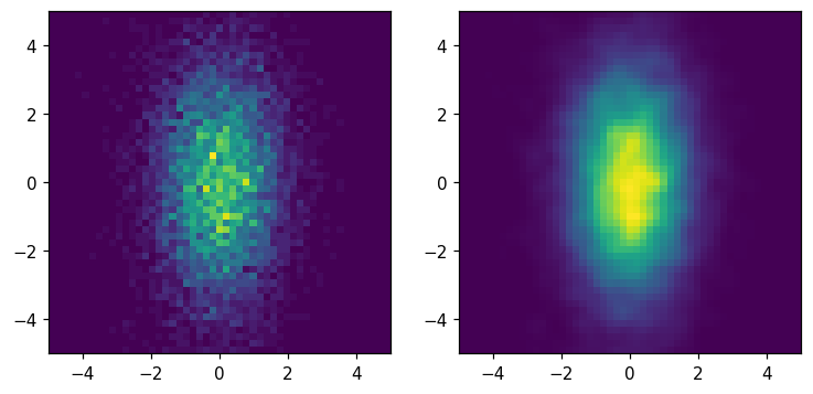
Transpose
[35]:
fig, ax = plt.subplots(1, 2, figsize=(8, 8))
hl.plot2d(ax[0], hh)
hl.plot2d(ax[1], hh.T)
for a in ax:
    a.set_aspect('equal')
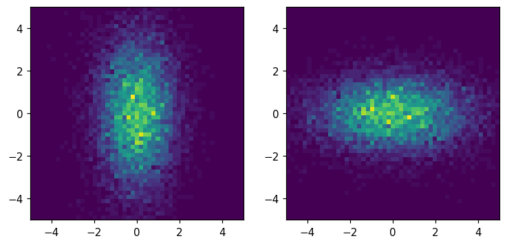
Smoothing
[36]:
fig, ax = plt.subplots(1, 2, figsize=(8, 8))
hl.plot2d(ax[0], hh)
hl.plot2d(ax[1], hh.gaussian_filter(1))
for a in ax:
    a.set_aspect('equal')
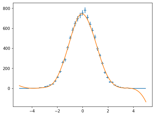
Spline Fit
[37]:
fig, ax = plt.subplots()
hl.plot1d(ax, h, crosses=True)

X = np.linspace(-5, 5, 1000)
s = h.spline_fit()
ax.plot(X, s(X))  # naturally, overshoots in region without data...
/home/mike/.local/lib/python3.8/site-packages/matplotlib/axes/_base.py:2283: UserWarning: Warning: converting a masked element to nan.
  xys = np.asarray(xys)
[37]:
[<matplotlib.lines.Line2D at 0x7f079a5d9d60>]
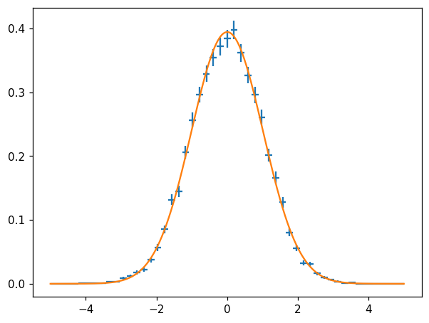
Function fit
[38]:
fig, ax = plt.subplots()
hl.plot1d(ax, hn, crosses=True)

params, cov = hn.curve_fit(lambda x, loc, scale: stats.norm.pdf(x, loc, scale))
ax.plot(X, stats.norm.pdf(X, *params))
/home/mike/.local/lib/python3.8/site-packages/matplotlib/axes/_base.py:2283: UserWarning: Warning: converting a masked element to nan.
  xys = np.asarray(xys)
[38]:
[<matplotlib.lines.Line2D at 0x7f079a70a9a0>]
Slicing in binning units
[39]:
fig, ax = plt.subplots(1, 2, figsize=(8, 4))
hl.plot1d(ax[0], h[0:])
hl.plot1d(ax[0], hh[0])
hl.plot2d(ax[1], hh[0:,0:])
[39]:
<matplotlib.collections.QuadMesh at 0x7f079a85a820>